Mastering Color Theory in Home Decorating
Hello, decor enthusiasts! Ever wonder why some rooms just seem to feel right, with everything in perfect harmony? A lot of that "rightness" comes down to the colors used in the space. Understanding color theory can be a game changer when it comes to decorating your home. In this blog, we’ll explore how you can choose paint colors and coordinate a color scheme to create a cohesive and inviting look in your home. Plus, I’ll point you towards some handy tools like sample paint pots and color wheels that will help you make the best choices.

Phoo on Pexels by: Karolina Grabowska
Understanding the Color Wheel
First things first, let’s talk about the color wheel. It’s a simple tool that shows the relationships between colors. Here are the basics:
Primary Colors: Red, yellow, and blue are the bases from which all other colors are made.
Secondary Colors: Green, orange, and purple, made by mixing primary colors.
Tertiary Colors: Created by mixing primary and secondary colors, like red-orange or blue-green.
Using a color wheel can help you understand how different colors relate and contrast, which is crucial when you’re trying to pick a palette that works.
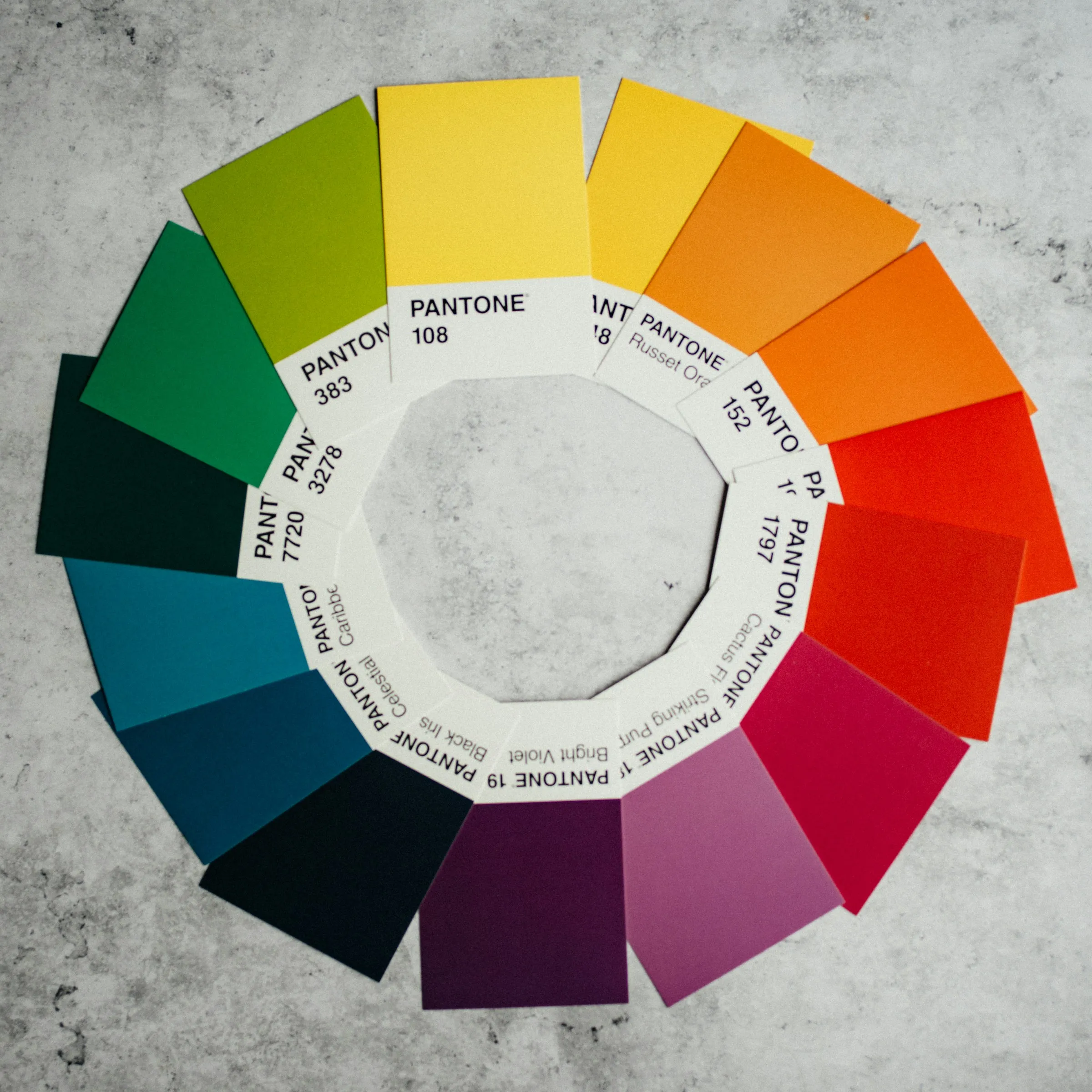
Photo on Unsplash by: Annie Spratt
Choosing Your Base Color
When selecting a base color for your room, think about the mood you want to set. Colors have temperatures and psychological effects:
Warm colors (reds, oranges, yellows) are vibrant and energetic, great for social spaces like living rooms and kitchens.
Cool colors (blues, greens, purples) are calming and relaxing, perfect for bedrooms and bathrooms.
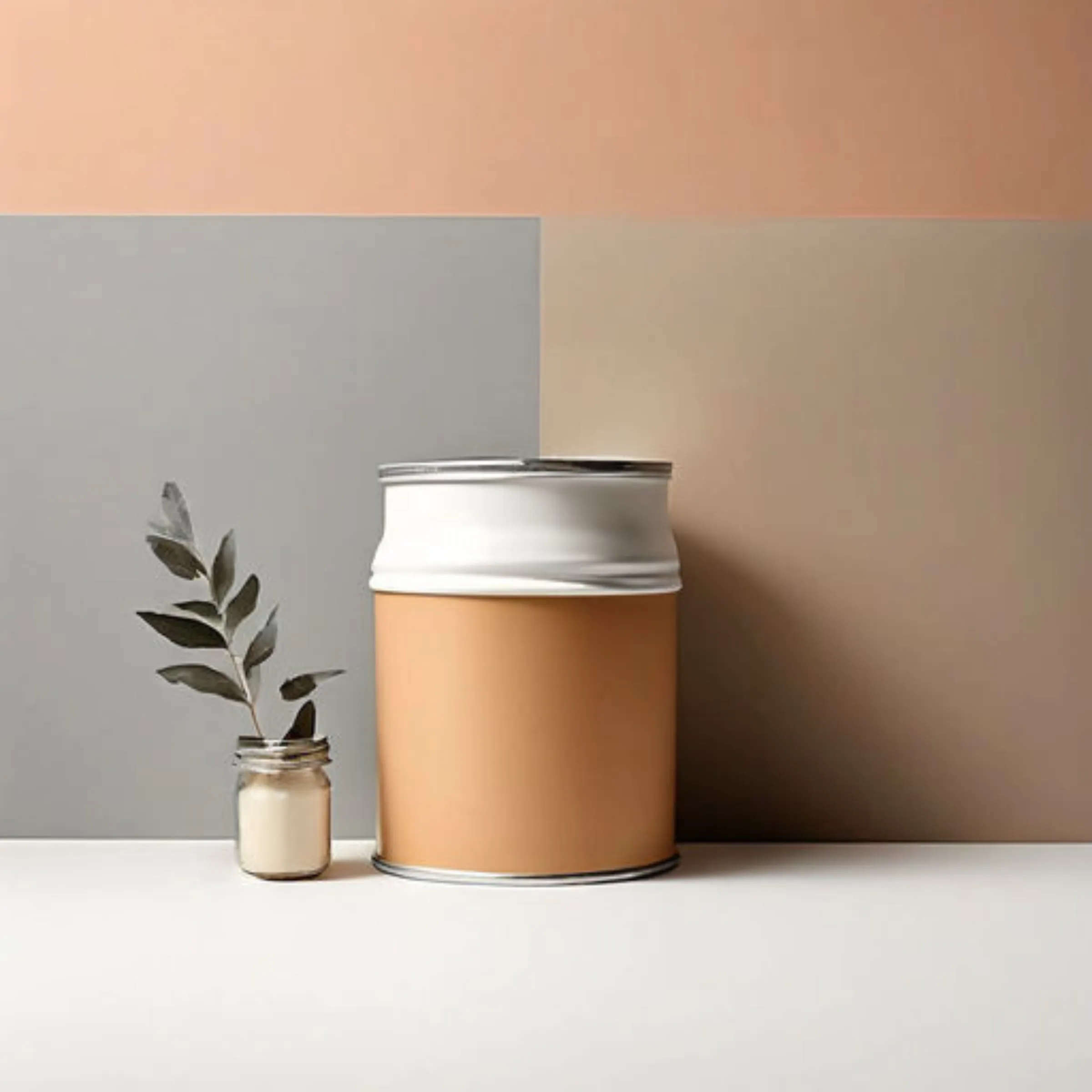
Once you’ve picked your base color, you can use it to create a color scheme.
AI Picture Created on Playground AI
Types of Color Schemes
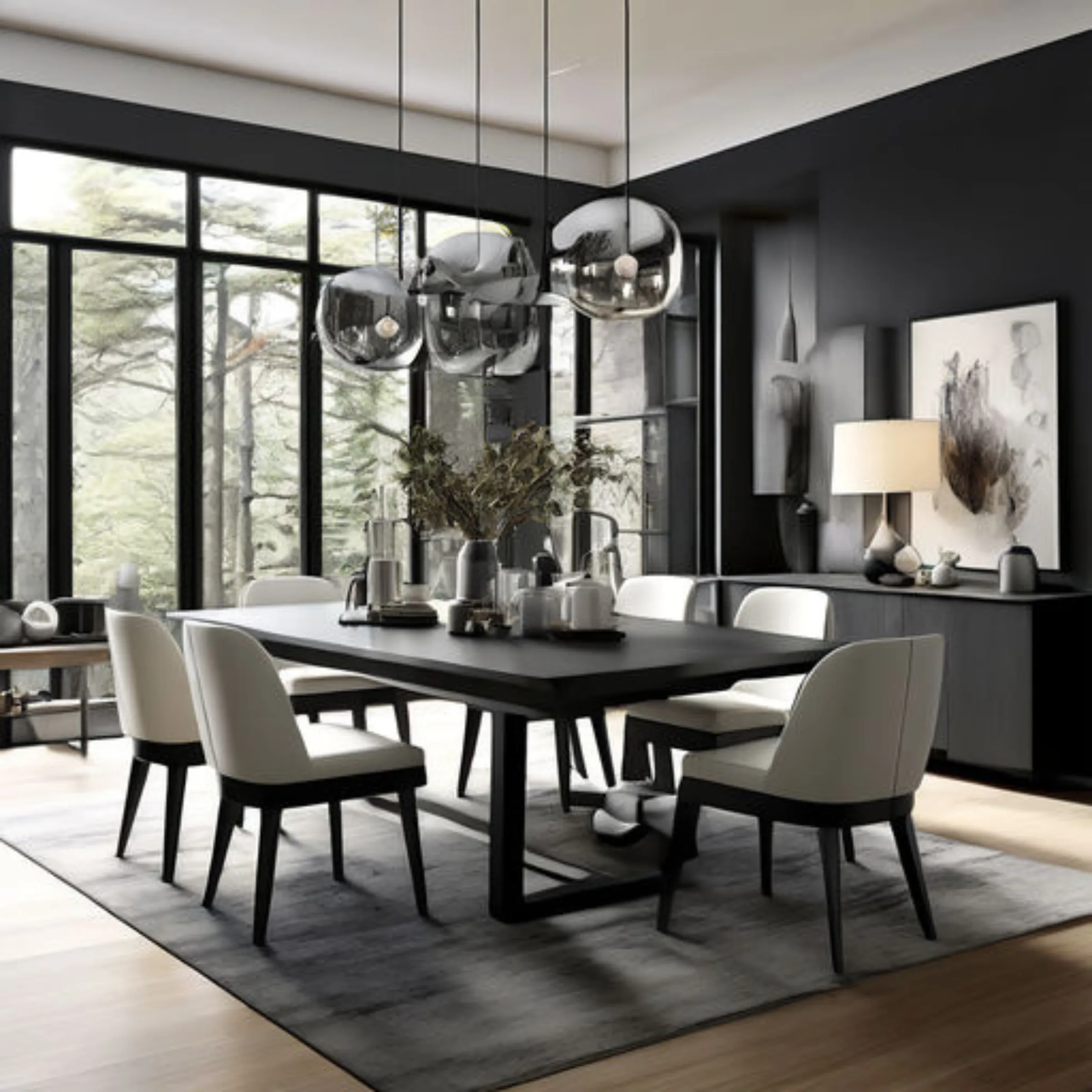
1. Monochromatic: Uses various shades and tints of one color. This is a very harmonious look but can lack contrast. To add interest, mix different textures and finishes.
AI Picture Created on Playground AI
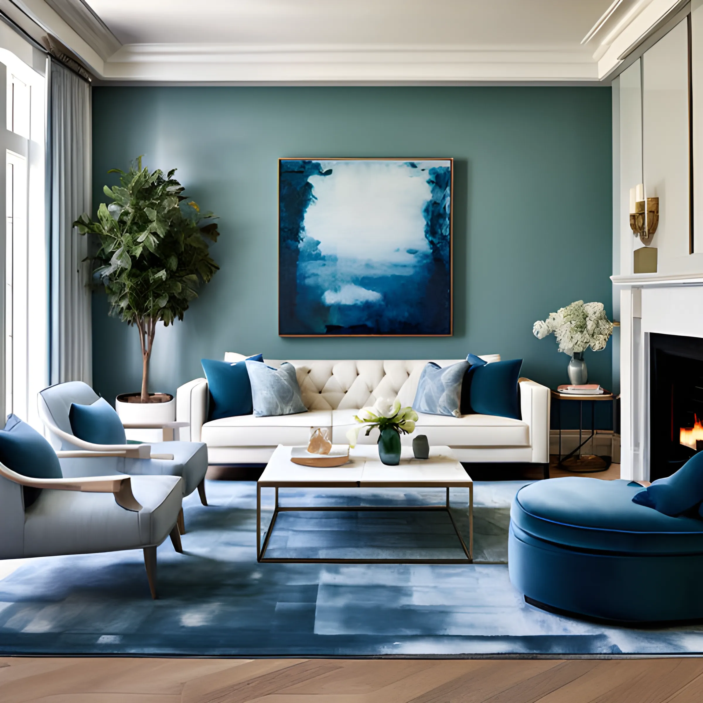
2. Analogous: Combines colors that are next to each other on the color wheel. For example, a scheme of blues and greens. This creates a serene and comfortable design.
AI Picture Created on Playground AI
3. Complementary: Uses colors opposite each other on the color wheel, like blue and orange. This scheme is high in contrast and very dynamic.
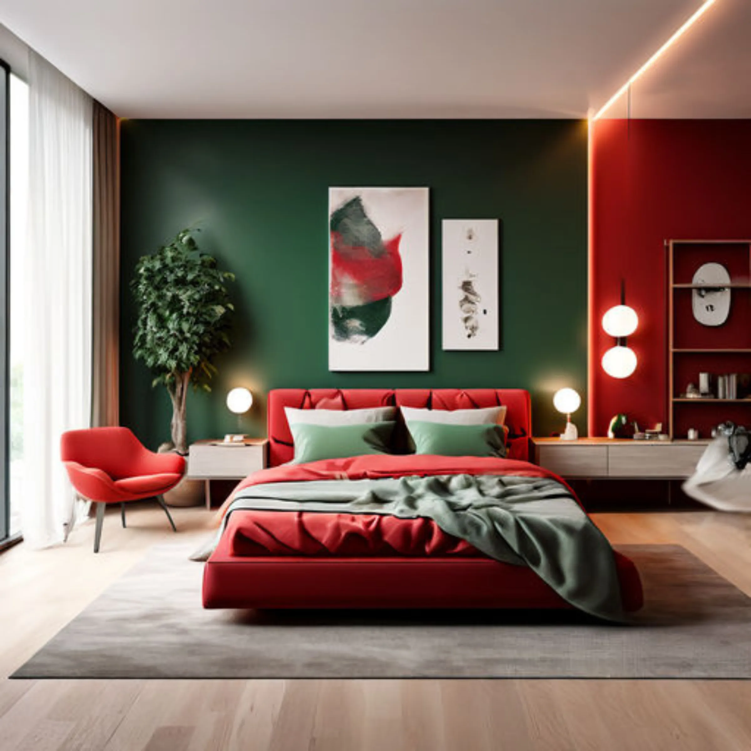
AI Picture Created on Playground AI
4. Triadic: Involves three colors evenly spaced around the color wheel, such as red, yellow, and blue. This offers a vibrant atmosphere if balanced well.
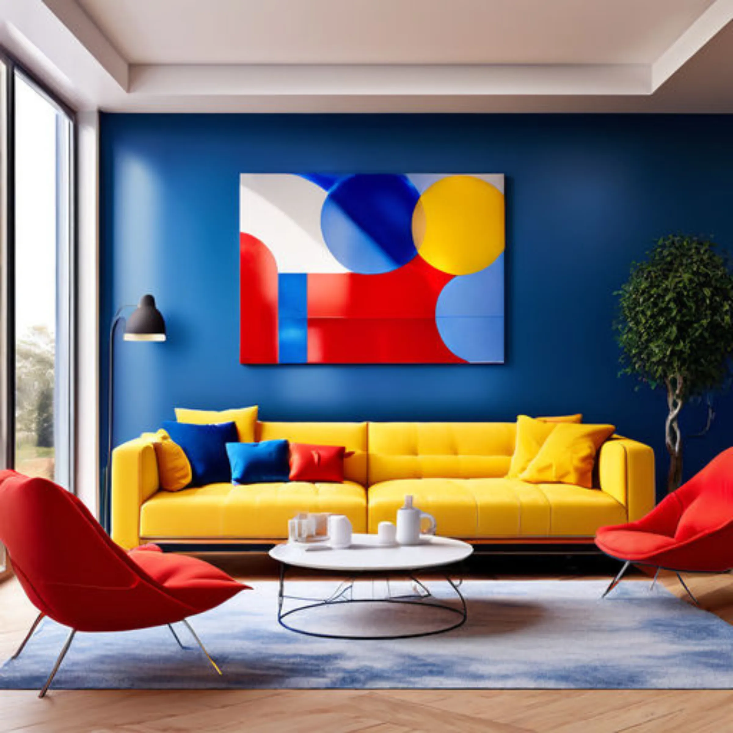
AI Picture Created on Playground AI
Using Sample Paint Pots
Before you commit to a new paint color, I highly recommend using sample paint pots. Paint a large patch on your wall to see how the color looks in different lighting conditions throughout the day. This can help you avoid surprises and ensure you’re happy with your choice.
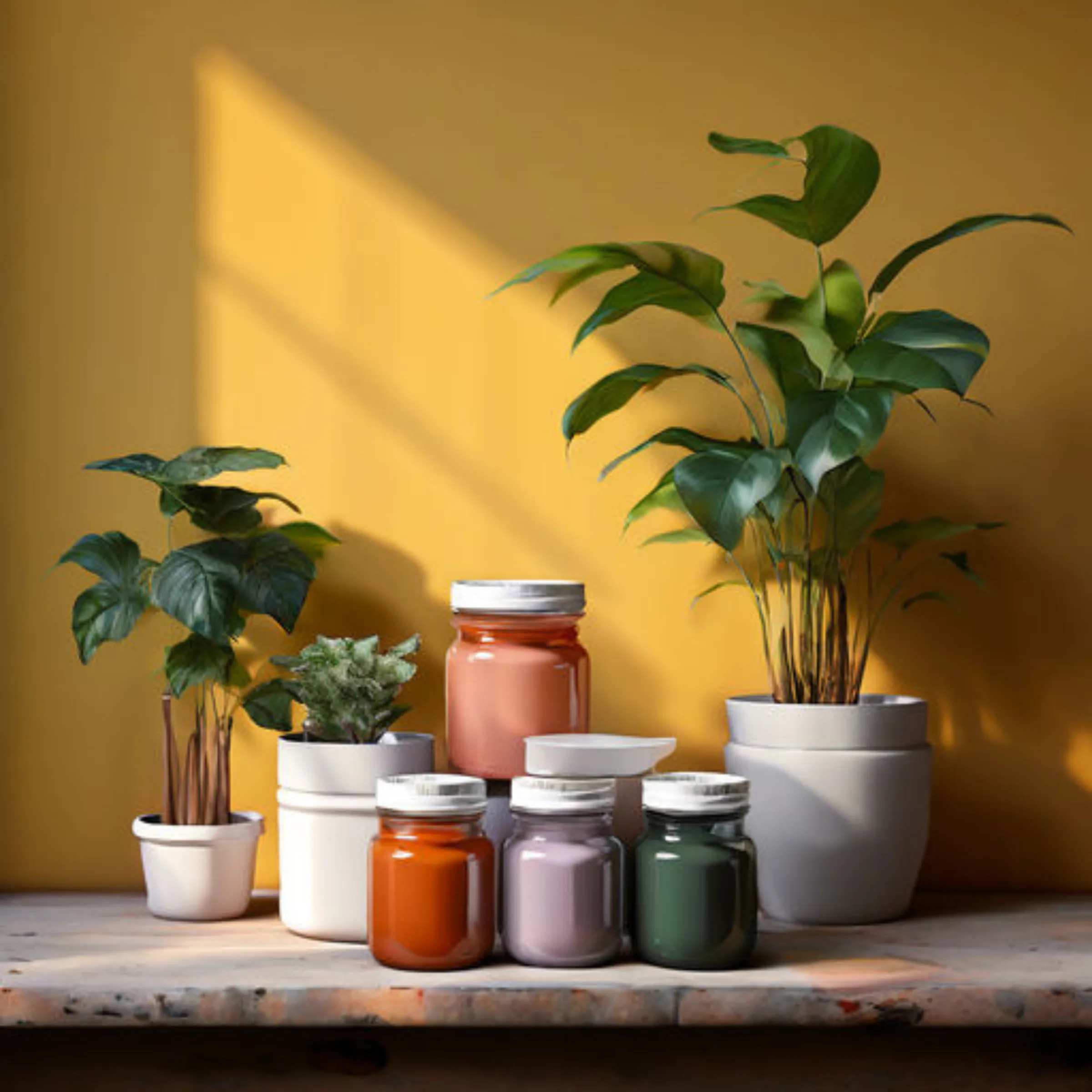
AI Picture Created on Playground AI
Coordinating Decorative Items
Once your color scheme is set, choose decorative items to complement your palette. If your walls are a neutral color, opt for colorful accent pieces like cushions, vases, or rugs to add splashes of your accent colors. If your walls are bold, consider more subdued tones for your furniture and accessories.
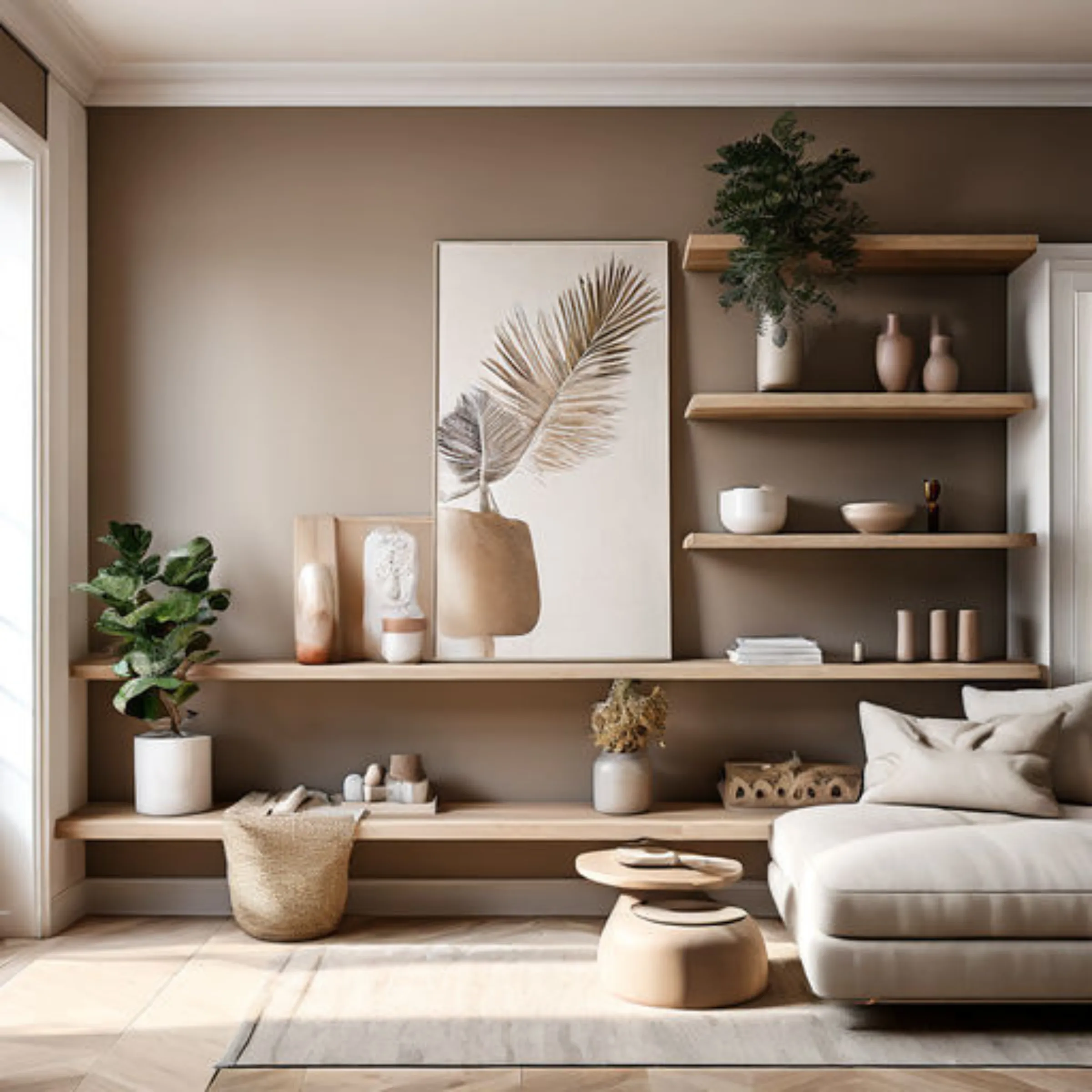
AI Picture Created on Playground AI
Essential Tools for Color Coordination
Color Wheel: This is your best friend when it comes to understanding which colors work well together.
Sample Paint Pots: Essential for testing colors in your actual space.
Mood Boards: Create a visual collage of your furniture, fabric swatches, and paint samples to see how they all work together before making final decisions.
You can find color wheels and sample pots at most home improvement stores, and many paint brands offer small sample pots that you can order online.
Choosing the right colors for your home doesn’t have to be daunting. With a basic understanding of color theory and the right tools at your disposal, you can create a space that feels just as good as it looks. So grab that color wheel, pick up some sample pots, and start bringing your home decor visions to life!
Happy decorating!

At Beautiful Life - Beyond Designs, some of the links on our website are affiliate links. This means that if you click on these links and make a purchase, we may earn a small commission at no extra cost to you. These commissions help support our site and allow us to continue providing you with valuable content and resources. We only recommend products and services that we believe will add value to your interior design journey. Your support not only keeps our passion for design alive but also helps us bring more beauty and creativity into your spaces. Thank you for being a part of our journey and for supporting my small business!
Contact [email protected] for more information
Copyright © 2021 - 2025. Made with Groove.cm - All rights reserved.